
Recognising Intuition
It is generally considered high praise for an interactive design to be described as ‘intuitive’ by its users. The label ‘intuitive’ implies ease of use and logical operation that does not require the user to think. In fact, it is the user who is being intuitive, somehow knowing what to do in specific contexts when presented with a range of interaction choices. The designer has cleverly identified elements of the user’s subconscious understanding of visual signs and processes.
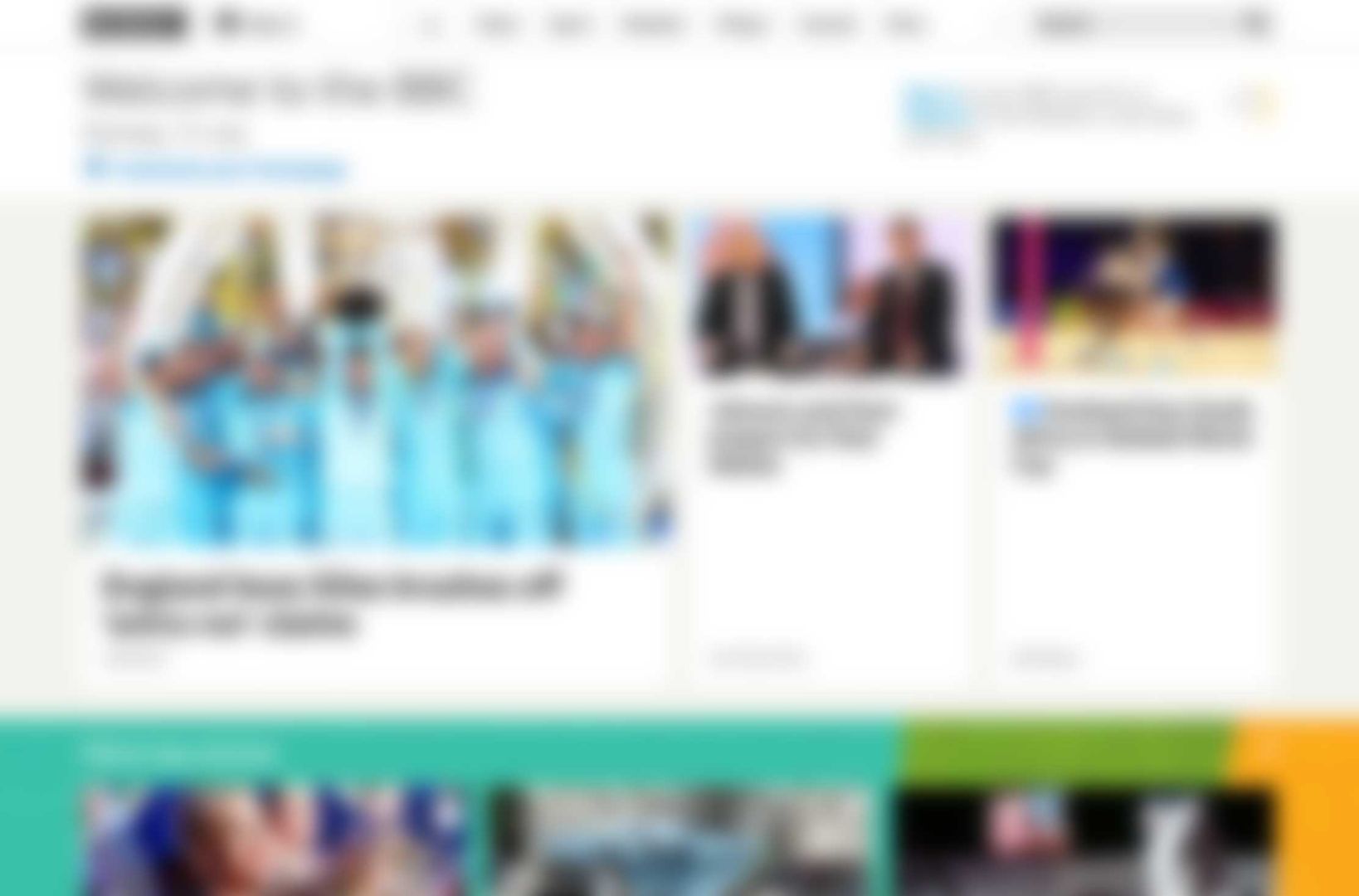
A squinted or blurred view of an interface can help designers to focus on the structure. If you recognise the menu layout in the image above, where would you expect to find the Search and Sign In features? Tap, click or download the image to see the original. Download Image
It has been said that ‘the only intuitive interface is the nipple’ and that our lives from birth provide us with experiences that help us develop intuitive understanding that we can apply in different situations. If this is true, then designers can expect different intuitive responses from users with different life experiences.
Unfortunately, this means that a user interface that some find intuitive, others will find unintuitive. In this activity you will aim to recognise intuition similarity (or variation) between two or more users.
Activity
You will need a pen, plain paper, squared paper, scissors, a camera and at least two people to provide the user data (User A and User B). This activity is designed so that you can see how useful insights to your users intuition can be gained with few resources. It is not necessary to have more than two test users although this may make it more fun and possibly more effective.
Steps
Canvas
Create an interface ‘canvas’ with a sheet of squared paper (a 10mm or 3/8 inch grid is ideal). Users need to know that this represents the ‘screen’ of the interactive device for example a tablet or desktop computer.Download: Printable Squared Paper PDF
Elements
Create 12 interface elements out of paper, each measuring 50 x 10mm or 2 x 3/8 inch. Write one of the titles from the list below on each element. Add a small arrow on elements that will typically take up a larger area than the paper element itself. The user can decide how much extra space to allow.Download: Printable Interface Elements PDF
- Search
- My account
- Departments
- Buy
- Price
- Sign-in
- Choose quantity
- Contact us
- Sale feature product
- Product photograph
- Customer reviews
- Product description
User 'A' test
Making sure that User B is not able to observe or hear this step, ask User A to place each interface element on the squared paper in a position where they would intuitively expect to find it when visiting an online store. You will need to explain that the sheet of squared paper represents the ‘screen’ and the arrows on some elements mean that they need extra space.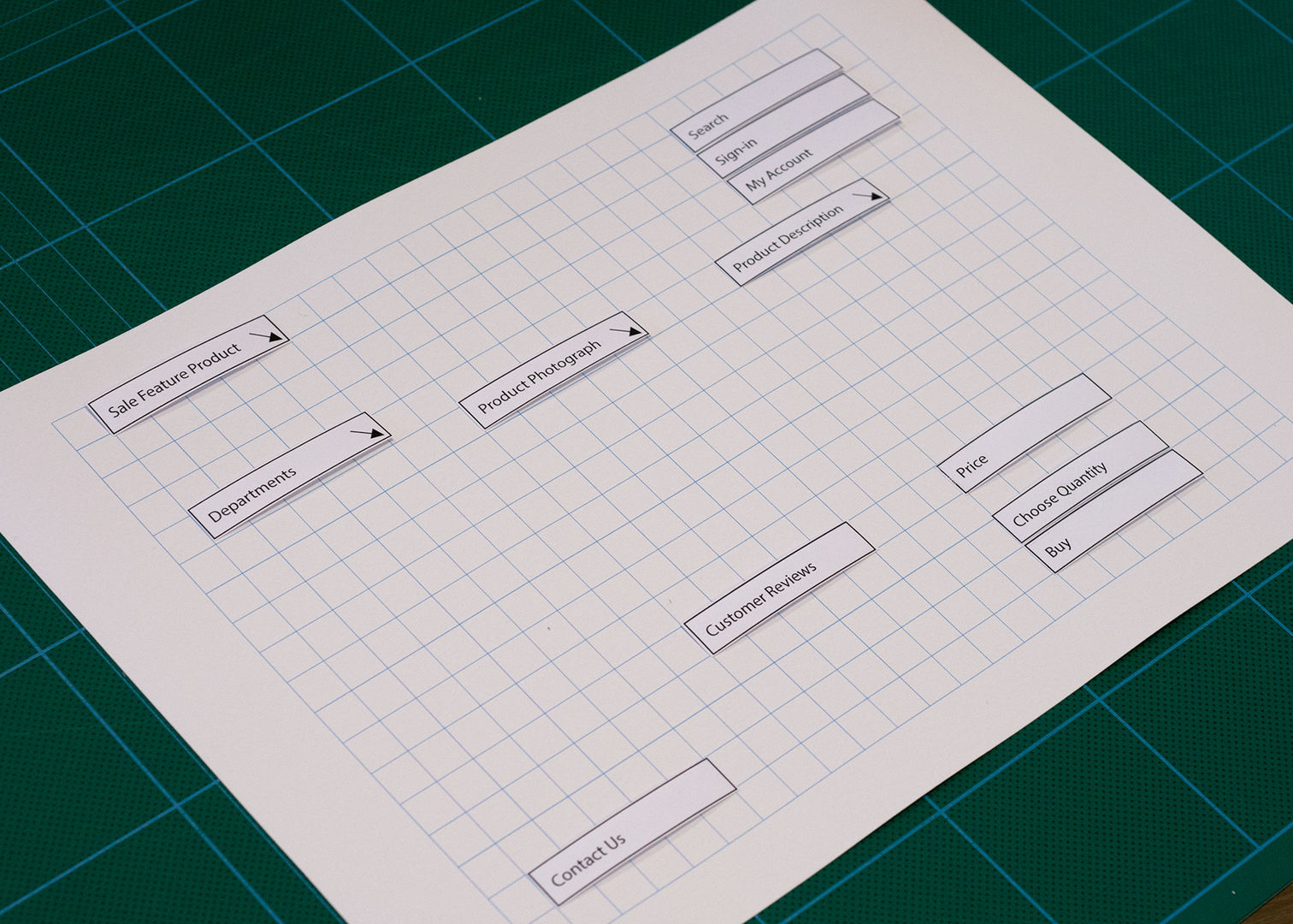 The 'interface canvas' after User A placed all of the provided elements.
Record the layout made by User A
When all the elements are in place take a photograph (like the one above) to record the layout arrangement.
Before removing the elements, draw a pencil outline around each one (as shown below).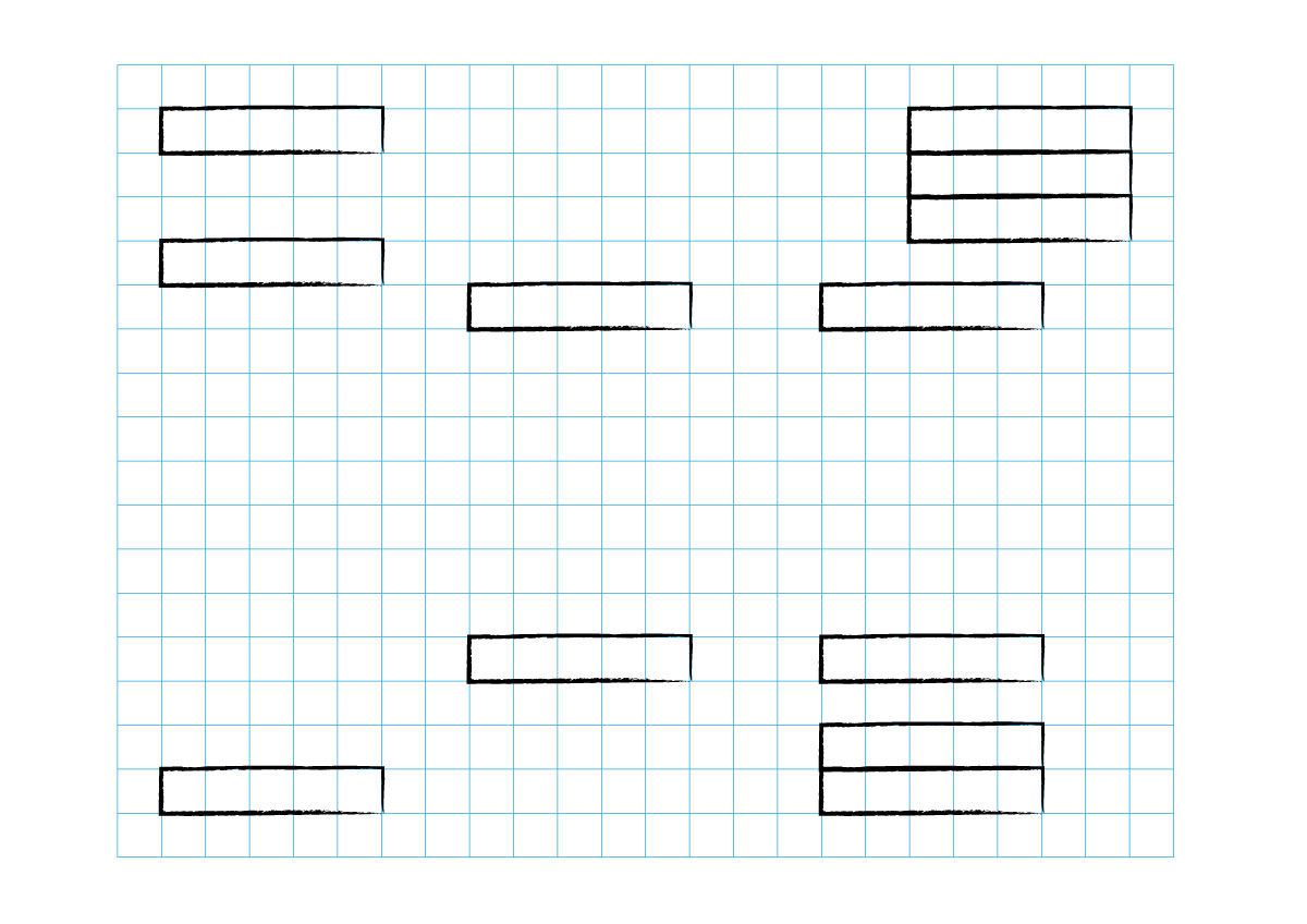 The 'interface canvas' outlines made after Step 3.
Find the variance between User A and User B
Ask User B to place each interface element on the canvas inside one of the pencil outlines drawn in Step 4. They should position them in the space closest to where they would intuitively expect to find them when visiting an online store.Identify differences
When User B has placed all the interface elements in position, refer to the photo taken in step 4 to identify differences between the two results. Discuss any differences in the choice of element layout with the two users. If the layout arrangements appear substantially different then continue testing with more users to build a better understanding of different intuitive responses. If the differences are slight, then the design already has a good chance of success.
Outcomes
If this activity has been successful, then you will have identified any differences in the intuitive response of the two users. Where conflicts exist, these can be reduced by applying cues that are intuitive to both users, such as the use of scale and colour to create a visual hierarchy. Even a very minor change in visual design has the potential to change the user experience.
This very low tech approach can be validated using A-B testing on production websites. An A-B test automatically routes a percentage of visitors to slightly different versions of the same website and the results of their actions are recorded and analysed.